01The challenge
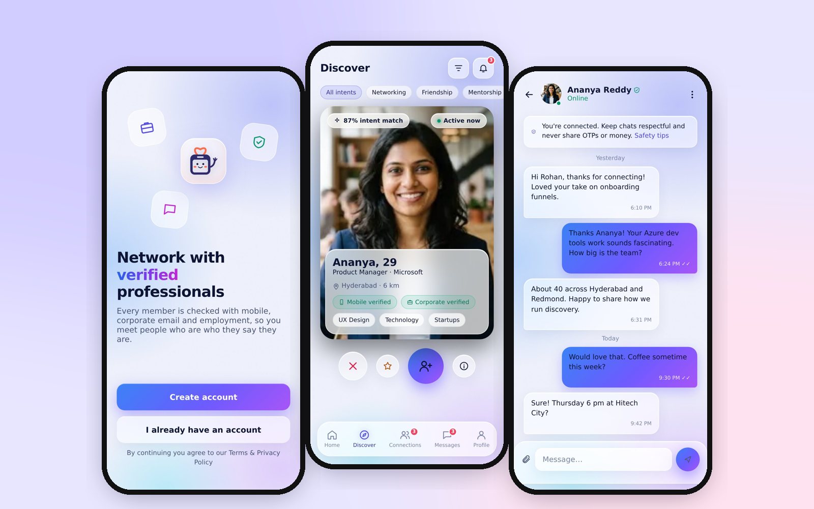
People in corporate India want to meet peers outside work, but the products they can use either ignore the personal side (career networks) or lack credibility (dating and matrimony apps full of unverifiable profiles).
The product had to make trust the default without making onboarding feel like a bank KYC form, keep four very different intents (networking, friendship, dating, marriage) from colliding, and give a small team an admin console strong enough to keep the community clean.
Verified person+Verified professional+Explicit intent+Mutual consent+Safe communication
Try itLive prototype
This is the actual clickable prototype, running inside the page. Tap through onboarding, Discover, a profile, chat and the safety tools. All people and data in it are samples; nothing you type is saved or sent.
Prefer a bigger view? Open the full 96-screen index (new tab, includes the admin console).
02Approach
Positioning first
Wrote the product brief, audience (IT, product, design, finance, healthcare and bank professionals, 18+) and the one-line differentiator before drawing a single screen.
Trust as a flow, not a wall
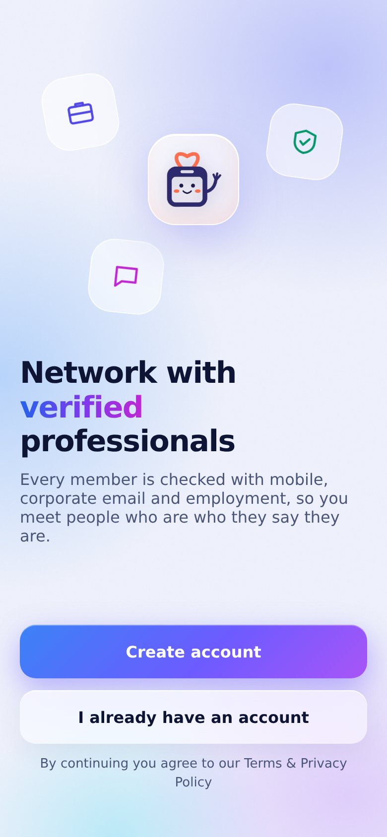
Verification is broken into visible steps (mobile, corporate email, employment, optional government ID) with a progress ring, so members always know what is left and why.
Intent drives everything
Members pick intents and a primary intent; discovery, match cards and filters are scoped to it, so a networking request never looks like a date request.
Built with AI, reviewed like a product
I used GenAI tools to generate and iterate screens and code fast, then reviewed every flow as a designer: copy, states, edge cases and accessibility.
03What I did
- Product strategy, audience definition and the verification model (one person, one account; ₹99 one-time membership to reduce spam)
- Information architecture and flows for 96 screens: onboarding, verification, profile, intents, matching preferences, privacy, payment and GST receipt, Discover, filters, connections, chat, report and safety centre, settings and account deletion
- Edge cases designed as first-class screens: under-18 gate, duplicate account, grace period, re-verify employment, new work email, verification failure
- A desktop admin console: dashboard, analytics, verification monitor and case review, users, suspended and blocked users, fraud risk, reports, moderation queue, payments and refunds, companies, intent and matching configuration, notifications, roles and permissions, audit logs
- Design tokens with light and dark themes, and a clickable Android prototype (Capacitor APK) that works fully offline for testers
Stack
04Key design decisions
A ₹99 membership as a spam filter
A small one-time fee, shown upfront with a GST receipt, raises the cost of fake accounts without turning the product into a subscription trap.
Verification badges everywhere they matter
Mobile and corporate verification chips appear on match cards, profiles and chat headers, so trust is visible at the moment of decision.
Consent before conversation
Chat opens only after a connection request is accepted; report and block are one tap away inside every conversation.
Prototype that behaves like the app
Splash, push approval, payment and KYC steps advance on their own like the real build, so testers react to the experience, not to a slideshow.
05Gallery
Screens shown at review quality; click any image to zoom. Higher-resolution versions are available on request.
06Outcome
CorpSakha is a working, clickable prototype of the full member journey and admin console, now in testing. It is the clearest example of how I work today: product thinking, UX architecture and UI craft, accelerated by AI tools from brief to installable prototype.
Planned for the real build: a Node.js and MySQL API, Socket.IO chat, Razorpay UPI payments, FCM push and DigiLocker / UIDAI identity checks.