01The problem
The original site worked but looked dated: a pill header that wrapped awkwardly with no mobile menu, mixed branding ("Let Go" vs "Classima"), plain listing cards, inline styles everywhere and a cramped admin form that relied on alert() popups. The brief was to make browsing and posting easy, especially on phones, with zero backend change.
02Who it is for
Local buyers browsing second-hand items, and the single site owner/admin who posts and manages ads.
03Features
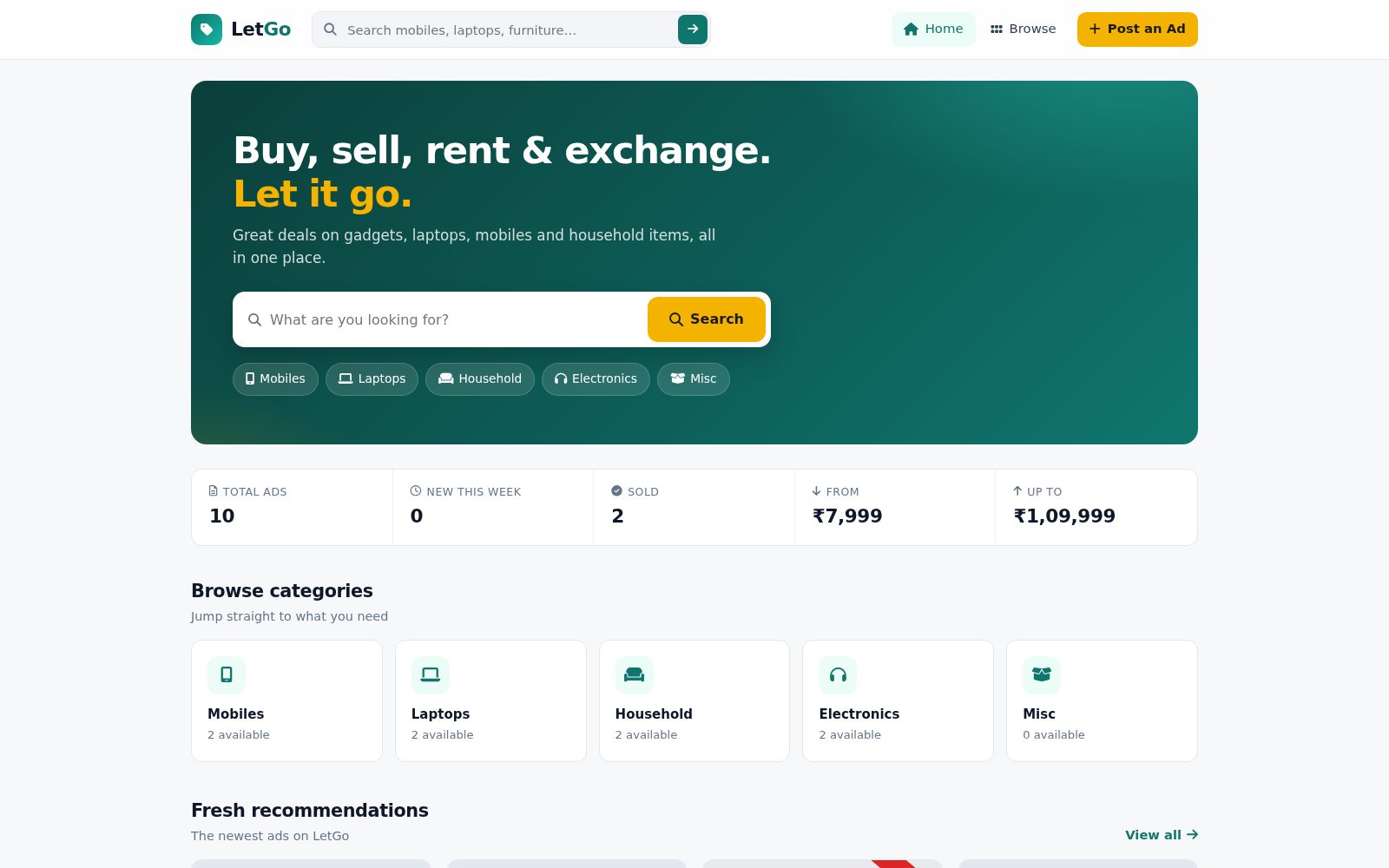
- Sticky header with search and mobile hamburger menu
- Hero search with quick category chips
- Slim stats strip (total ads, new this week, sold, price range)
- Category tiles with live available counts
- Filter bar: category pills, sort by newest or price, hide-sold toggle
- Shareable URL filters (?q=, ?cat=, ?sort=, ?hideSold=1)
- Listing cards with condition badge, photo count and SOLD ribbon
- Item gallery with swipe, keyboard arrows and full-screen lightbox
- Contact card with Call, WhatsApp and Email buttons
- Admin dashboard: Post an Ad, My listings, Contact settings
- Labelled post form with inline validation and live photo preview
- Loading skeletons, toasts and styled confirm dialogs
04Pages & screens
- Home
- Browse / All ads (grouped by category)
- Search results
- Item detail
- Admin login
- Admin: Post an Ad
- Admin: My listings
- Admin: Contact settings
05Stack
06How I built it with AI
Srini wrote a requirements document (Srini Classifieds Requirements v1.0
) describing the current system, the UI problems he observed, goals and numbered functional requirements (G1–G8 global, H1–H4 home, B1–B5 browse, D1–D7 detail, A1+ admin), with a sample form design as the preferred style. An AI coding assistant used that spec to produce the v1.0 drop-in replacement: rewritten pages and stylesheet, restyled templates, an ITERATION-v1.0 change log with a file-by-file summary, and a CHANGELOG listing what changed and what was deliberately left alone. Srini directed scope and constraints (without changing how data is stored or read
).
07Design highlights
Zero-backend-change redesign: same file names, Firestore collections and ClassimaDB API, so it uploads as a drop-in replacement
Design system in CSS variables — teal brand, yellow call-to-action, 12px rounded cards, 8px spacing — replacing all inline styles
Filters live in the URL so Home category tiles and shared links land on the right filtered view
Seller contact turned into tap-to-act buttons (Call, WhatsApp with pre-filled message, Email with pre-filled subject)
Admin posting rebuilt as a labelled two-column form with live photo preview and inline validation instead of alert() popups
08Gallery
Screens from the working build; click any image to zoom. Names, contacts and figures in the screens are demo content.